
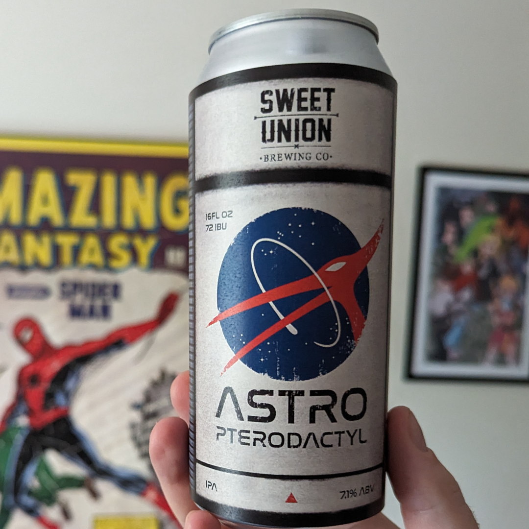
Astro Pterodactyl IPA

Tales From The Catacombs

Halfpenny Accounting

Minutemen Enterprise
Tow Line
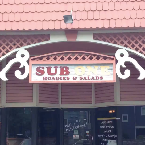
Sub One Rebrand

Visual Detail
Personal Logos

Social Media Design