Minutemen Enterprise, a logistics company, sought a logo that would convey professionalism and efficiency, reflecting their expertise in coordinating shipments and working with clients. The branding needed to communicate their quick and reliable service, in line with their name.
In discussions with the Minutemen Enterprise team, we identified key attributes to emphasize in the logo: professionalism, efficiency, and a focus on logistics. The logo needed to be clean and simple to communicate these qualities effectively.

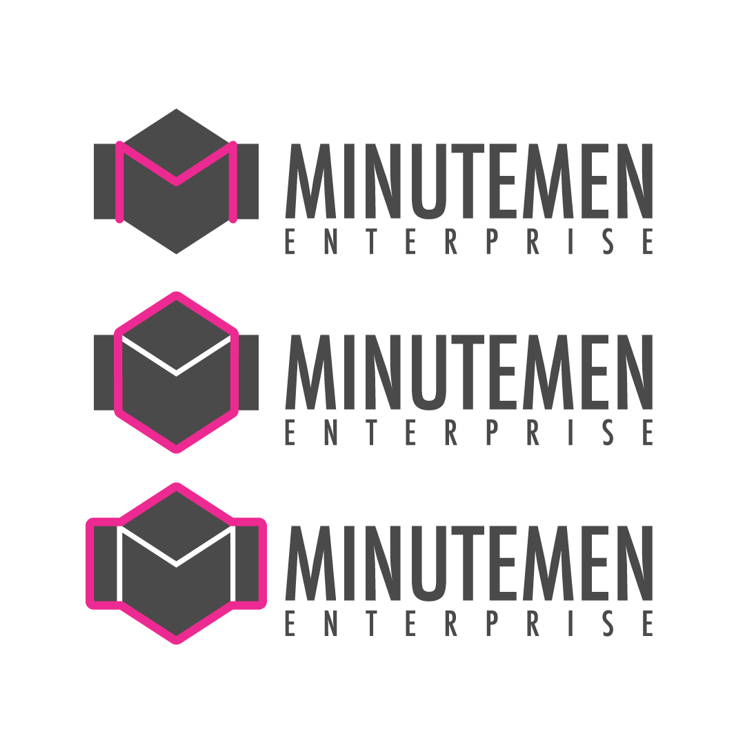
The final design featured an "M" as a prominent element, representing Minutemen. The logo also incorporated a box symbol, highlighting the company's logistics and shipment services. Additionally, the design included elements suggestive of a watch face, symbolizing timeliness and reinforcing the company's name and promise of quick service.
The resulting logo successfully encapsulates the essence of Minutemen Enterprise, combining professionalism, logistical focus, and timeliness. This branding helps establish a strong visual identity, reinforcing the company's reputation for efficient and reliable service.