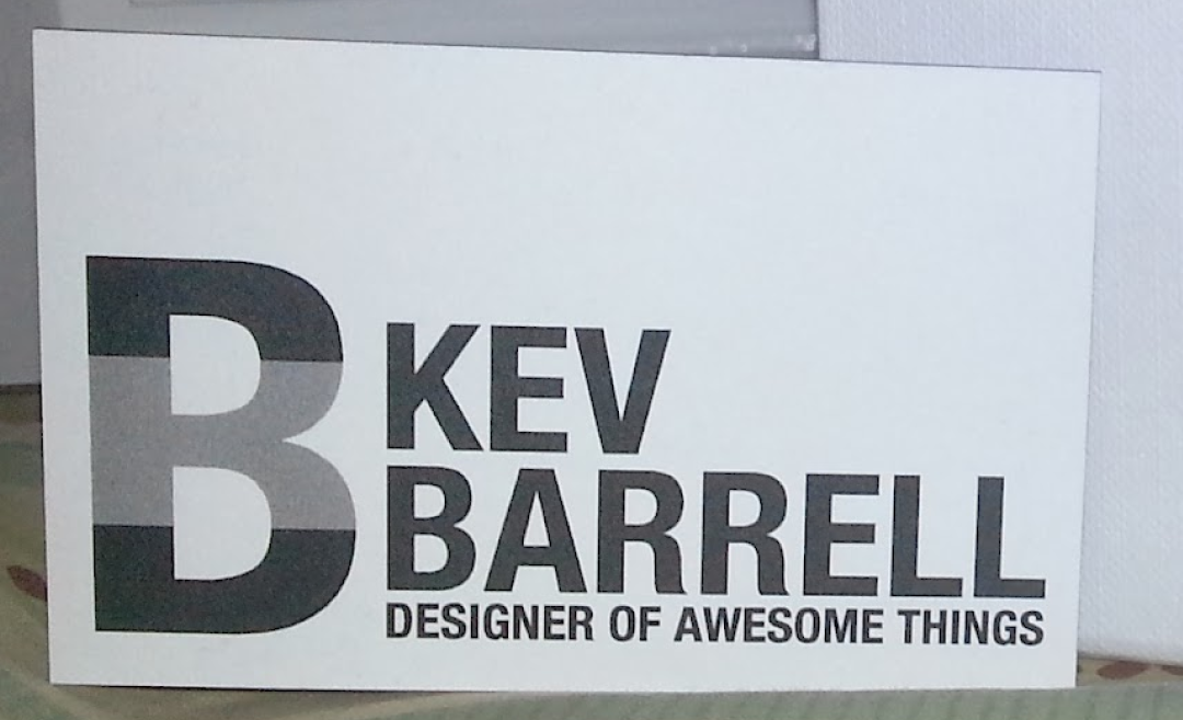
Kev Barrell
The design of my personal logo has been an evolving journey that mirrors my growth as a designer. I initially created the logo in 2013 when I began my freelance career. Over the years, I've refined and rebranded it to better represent my skills, style, and professional identity.
Initial Design - 2013
The original logo was created at the start of my freelance journey. It was an expression of my early design aesthetic and thought process. While it cleverly displayed a K inside of a B to reflect my name, it lacked the versatility needed for a professional logo.
Revised Design - 2015
As I gained more experience and knowledge about logo design, I recognized the importance of versatility and simplicity. In 2015, I revised the logo to be functional in one color, ensuring it would work well across various media and printing methods. This revision was a significant step in making the logo more practical and adaptable.
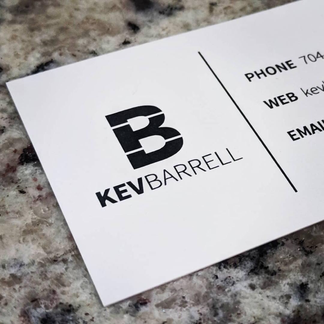
Rebrand Design - 2020
I undertook a complete rebrand to address some persistent issues with the previous logo. The earlier design had challenges with visibility, especially when scaled down, due to thin line weights. The rebranding process focused on creating a more robust and scalable logo, with clearer lines and a simplified design that maintained its identity even at smaller sizes. The new logo reflects a mature and polished representation of my brand, aligning with my evolved design philosophy.
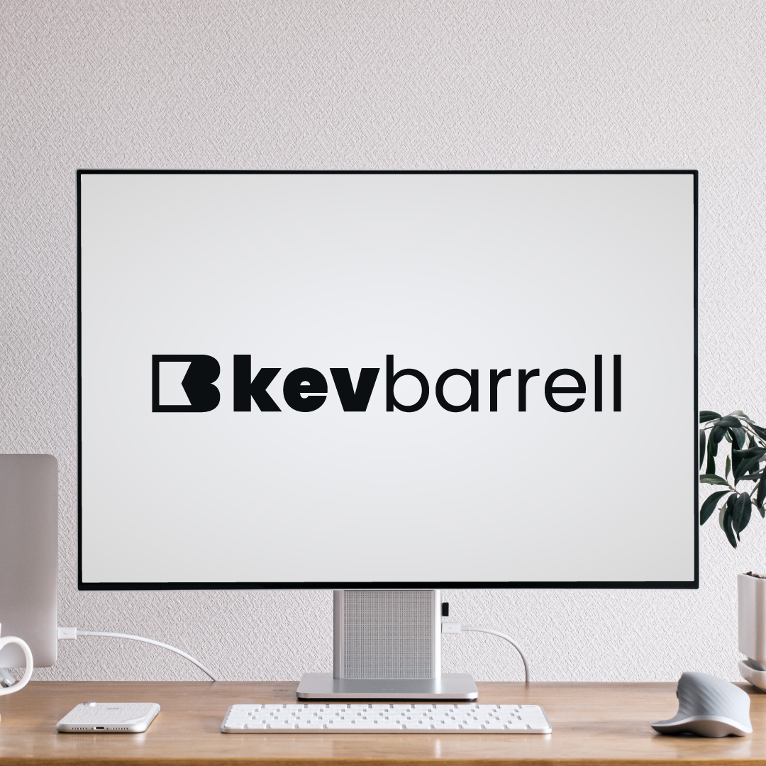
Conclusion
The evolution of my personal logo highlights my journey as a designer, showcasing my commitment to continuous improvement and professional growth. The current logo is a refined and versatile representation of my brand, embodying clarity, simplicity, and a modern aesthetic. This process underscores the importance of adaptability and the willingness to revisit and refine one's work as skills and insights develop.
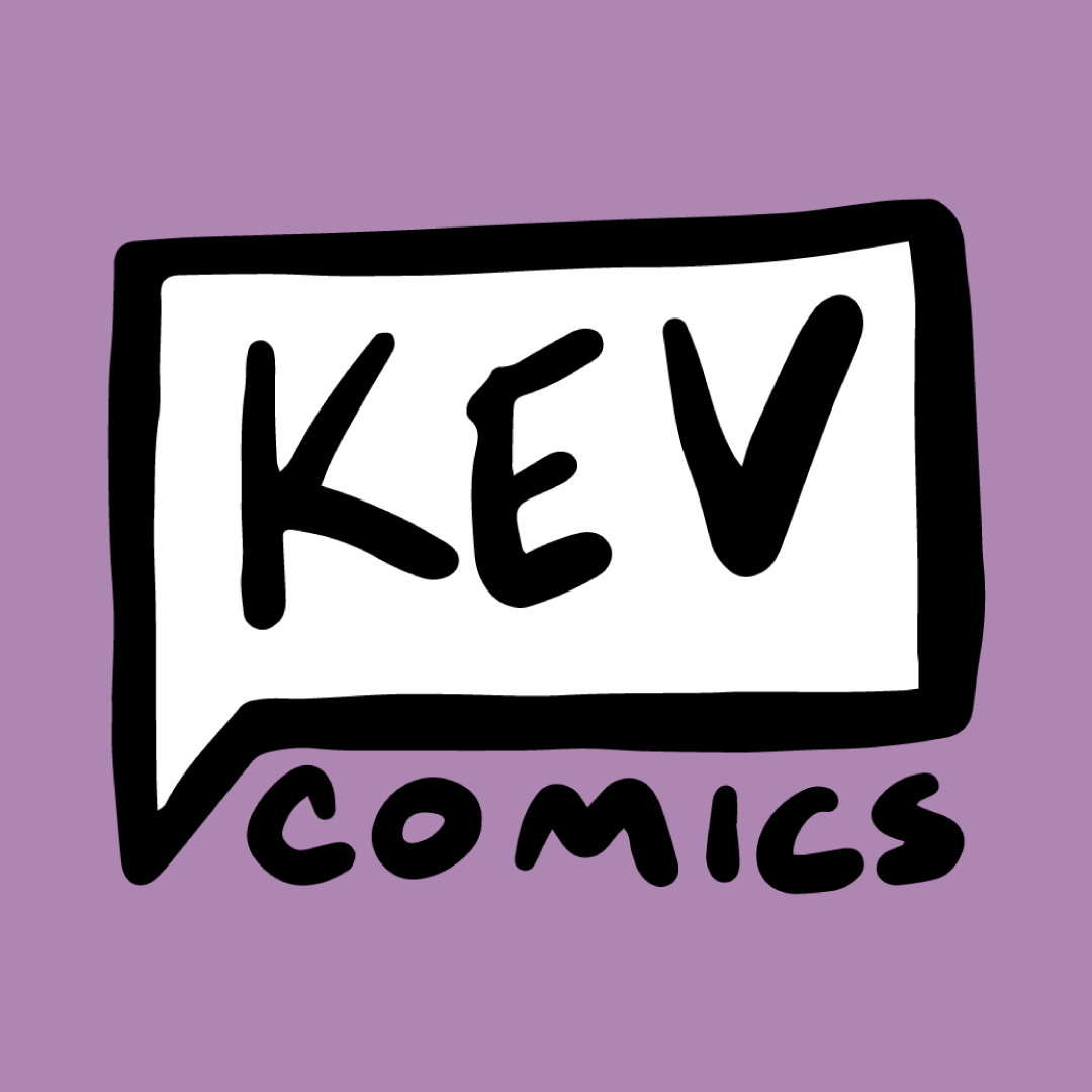
Kev Comics
The logo for Kev Comics was designed to encapsulate the essence of my comic art and brand identity. The aim was to create a logo that not only represents the playful and creative nature of my work but also establishes a recognizable and cohesive brand image.
The inspiration for the Kev Comics logo stemmed from the art style commonly used in my comics. I wanted the logo to reflect the hand-crafted, personal touch of my illustrations, which led to the decision to use a hand-written style for the text. This approach conveys a sense of authenticity and creativity, resonating with the informal and humorous tone of my comics.
To further connect the logo with the comic book theme, I incorporated a speech bubble element. The speech bubble contains the word "Kev" placed above "Comics." This design choice not only emphasizes the name but also playfully references the storytelling aspect of comics, where characters' thoughts and dialogue are often enclosed in speech bubbles.
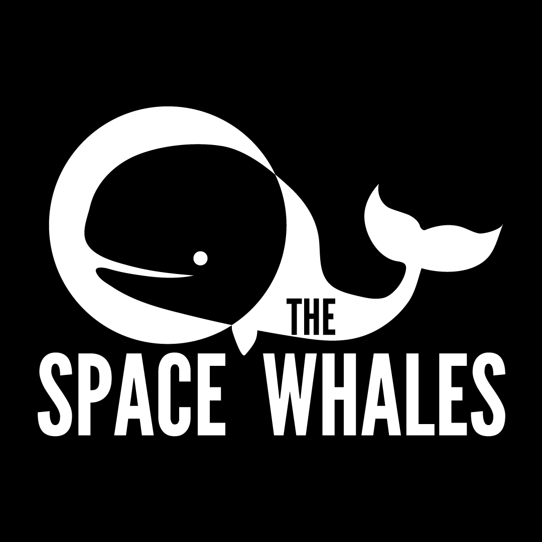
The Space Whales
The Space Whales is a solo comedy band where I write and perform humorous songs. The band name reflects a playful and quirky spirit, much like the songs I create. The name "The Space Whales" was inspired by the idea of whales in space, a humorous concept from Star Trek IV. The imagery of whales in space struck me as both absurd and amusing, perfectly aligning with the tone of my music. For the logo, I drew inspiration from the iconic logo of The Beatles, aiming to create a visual link to legendary music history with a comedic twist.
The central element of the logo features a whale, but with a twist: the whale is wearing an astronaut helmet, emphasizing the "space" aspect of the band's name. This whimsical imagery not only adds a humorous element but also distinguishes the logo as unique and memorable.
The Space Whales logo effectively captures the band's comedic and imaginative nature. It serves as a strong visual representation of The Space Whales' brand, encapsulating the playful and unique identity of the music.