
Tow Line, a newly established local towing company, approached me to create a logo and branding that would distinguish them from competitors and convey a sense of professionalism and confidence. In our initial meetings, the Tow Line team emphasized the importance of a bold and memorable visual identity. They wanted a color scheme that would stand out and a logo that would reflect their company name and services.
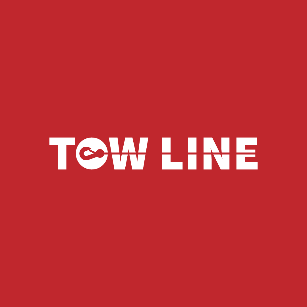
I chose a deep red color to represent boldness and confidence, paired with white to add a clean, professional contrast. The logo concept centered around the name "Tow Line," integrating a tow line motif to create a distinctive brand mark.
The final logo design featured the "O" as a central element, transformed into an icon with a tow hook. This design not only served as a recognizable logo but also as a versatile icon for social media and other digital applications. The tow line motif was extended through the rest of the lettering, visually reinforcing the company's identity.
In addition to the logo, I designed business card templates for Tow Line employees, incorporating the brand's colors and visual elements to maintain consistency across all branding materials.
