Challenge
The target audience for this web app are in the business or legal field and regularly spend a lot of time making organizational charts to assist with communication and relaying information to other members of their team. Most of our users make organizational charts in Microsoft Excel, which is a great program, but it can become a tedious and time consuming task.
Goals
My goals for this project are to understand and learn from the users who regularly make organizational charts and create a solution that improves their experience while also saving them time they could be spending on other important tasks. The target audience primarily makes organizational charts on their desktop computer at work, therefore my first priority will be designing for desktop.
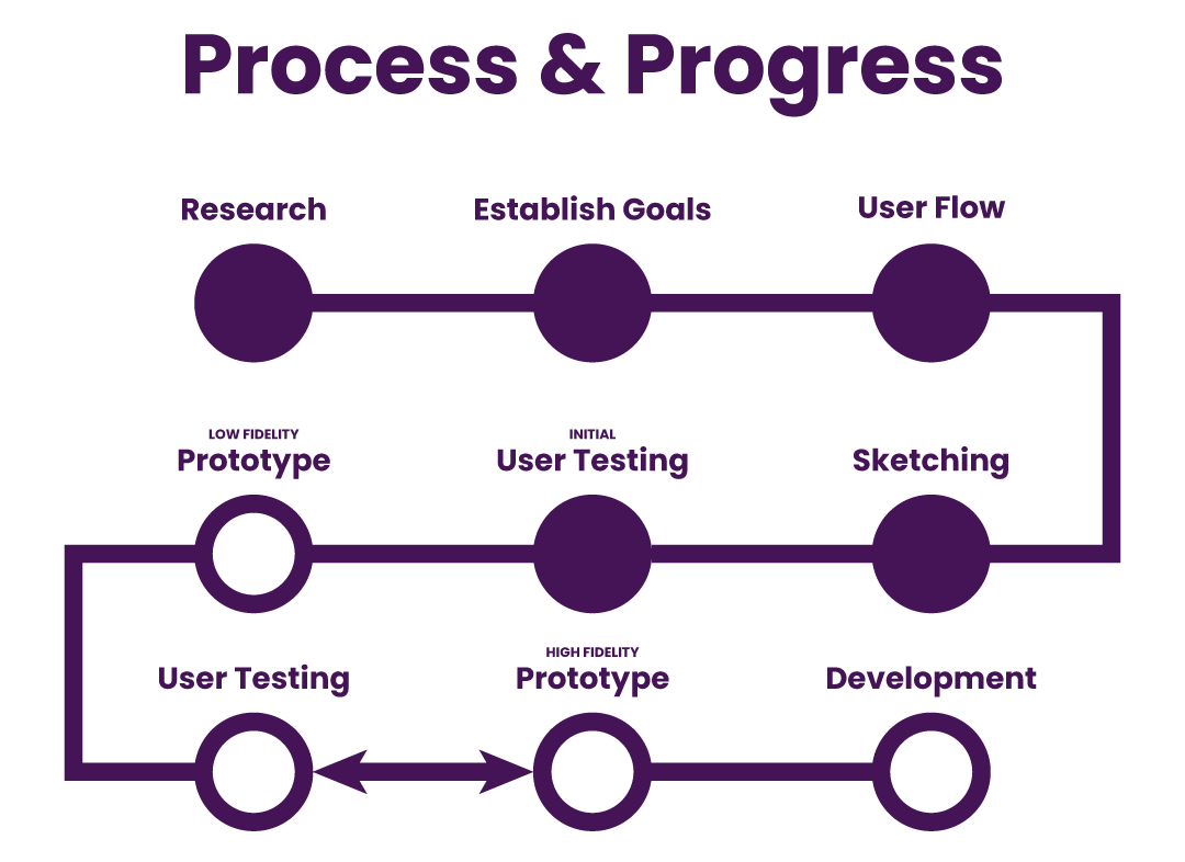
User Flow
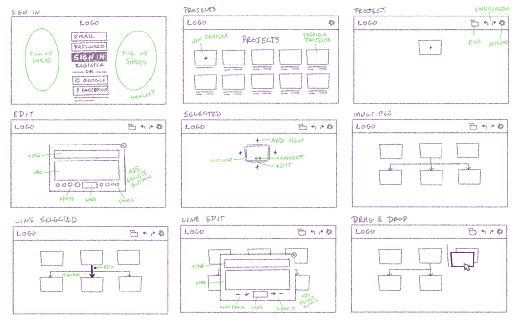
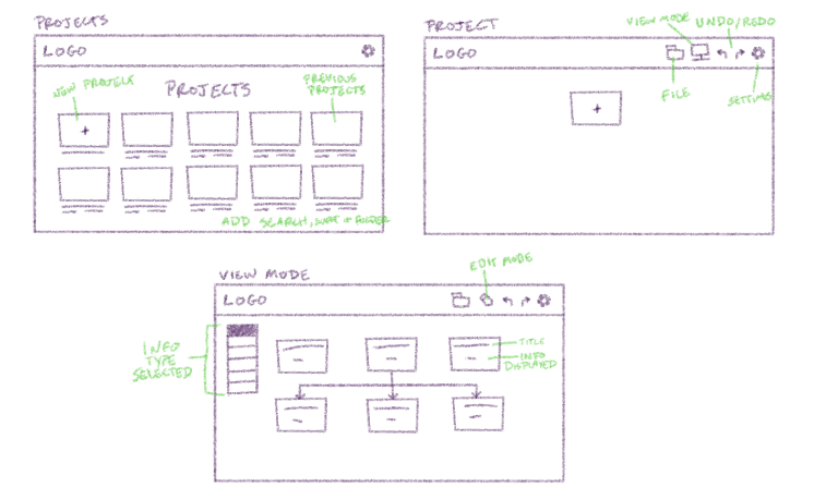
Upon research of issues users have with current organizational chart tools, I realized that I needed to make it as simple as possible by providing limited options. In the future, if adding options and solutions becomes a viable solution for a pain point, then I can add onto the web app, but for the initial prototype, I'm going to make it bare bones. A screen to log in, a screen to select different projects, and a screen for the workspace of the project itself were the most important. After that, I made some file options and some basic settings pages.
Sketching
Keeping simple in mind, I thought through what the project should look like when you start a new file. I decided that starting off with a square to be the most basic way to start a project. From there you can add information, add new squares or shapes with information, and then create lines and relationships between the shapes. You can even add information for the lines and relationships as well as drag and drop shapes you have made already into different areas. Making it dynamic and changeable saves a lot of time and makes it more forgiving for users.
User Testing
After speaking with users and getting feedback, I learned that users work with so many org charts that the projects page would become overwhelming. To resolve this, I plan to make a search, sort, and folder structure so that they can more easily find the specific project they're looking for. Also with this specific audience, there are certain categories of information that users need to be able to view at the same time, so I made a view mode where they are more easily able to toggle on and off certain information fields that they added to each shape.
UI Improvements
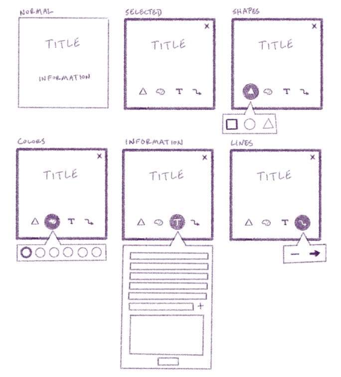
The new sketches were tested with users and they were very receptive to the changes. With the broader designs and functions narrowed down, it was time to get into the details. I wanted to make editing each shape as simple as possible. In my initial sketches, I used a pop-up menu that allowed users to make changes to a shape and information. While this got the job done, it was bulky and less intuitive. In order to create a more minimal experience, I designed the shapes so that when clicked on, icons appear that represent the types of things users can change. Clicking an icon makes an overlay appear beneath the shape. By clicking another icon or outside the shape, the overlay will disappear.